Product Design
Global Renewable Asset Monitoring
Designed a Geospatial Asset Management Dashboard for an enterprise client, focused on providing real-time portfolio oversight for Solar, Wind, and Storage assets.
Year :
2024
Industry :
Renewable Energy, Data Visualization, Geospatial Systems, Asset Management
Client :
Internal Product Design
Project Duration :
8 weeks
Problem : The Need for Global Strategic Oversight
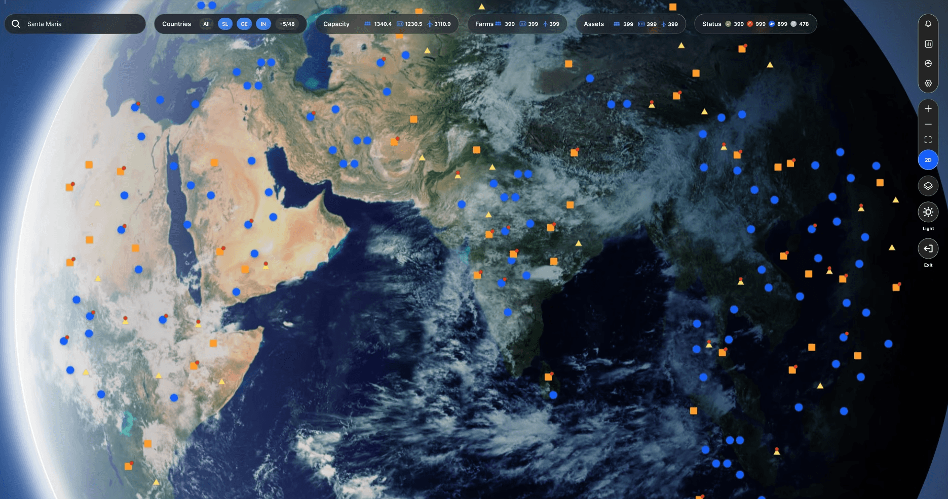
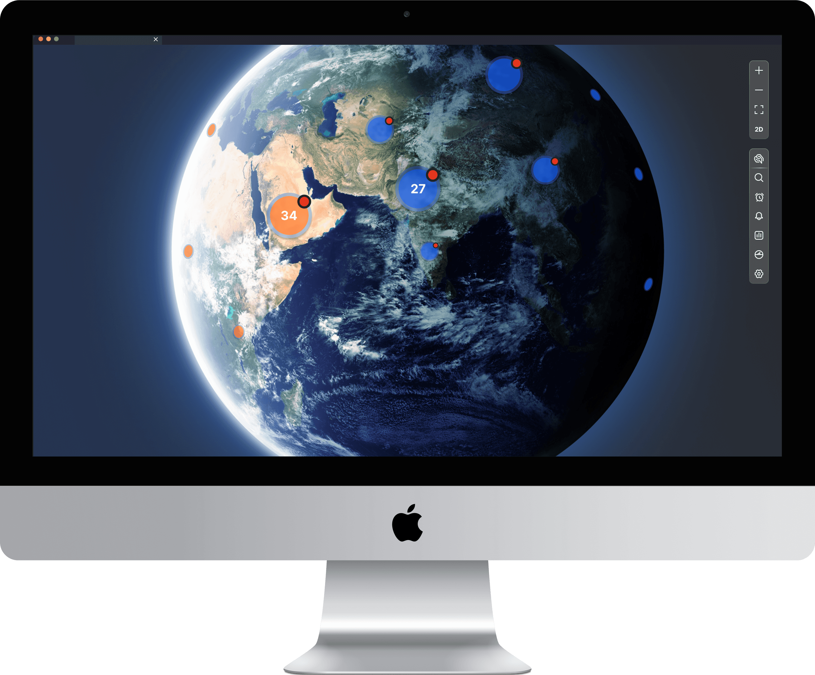
The primary challenge was designing a single application view that could manage and visualize the status of a global, diverse portfolio of energy assets (solar farms, wind turbines, and storage facilities). Users (Executive Managers, Portfolio Analysts) needed to quickly answer: “Where are my assets, how are they performing, and which ones need immediate attention?” This required balancing a stunning geospatial visualization with functional, filterable, and real-time data overlays.

Solution : Layered and Contextual Visualization
We structured the solution with two primary, highly interactive visualization layers:
A. Global Portfolio View (Strategic)
The initial view uses a 3D Earth projection to map all assets globally. Crucially, the top bar acts as a primary filter, allowing users to segment the portfolio instantly by Capacity, Asset Type (Solar, Wind, Storage), and Status (Green, Yellow, Red). The use of distinct icons (squares, circles, triangles) ensures clarity across asset types. This view is designed for quick strategic decision-making and prioritization across countries and regions.
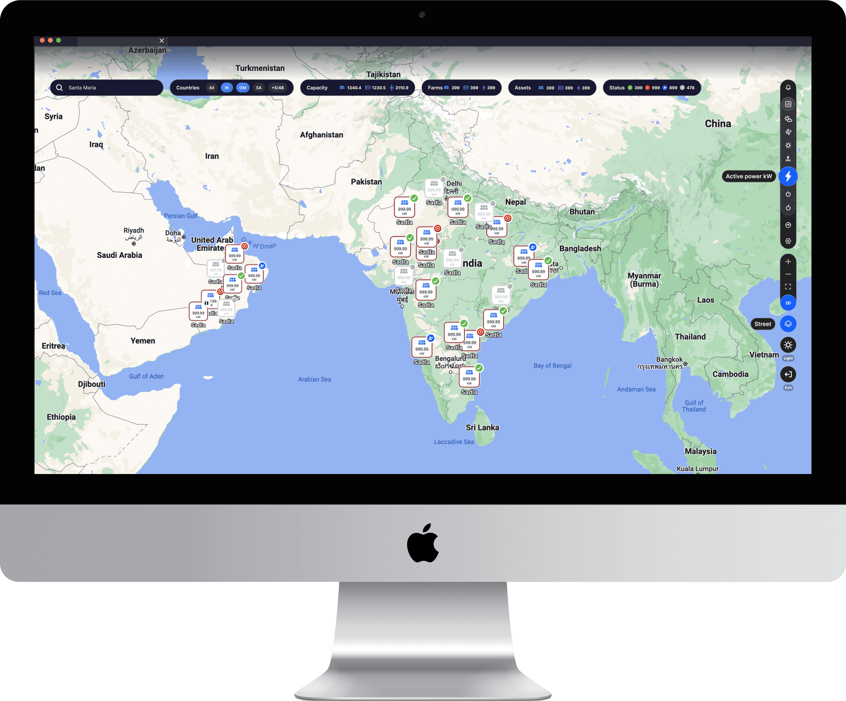
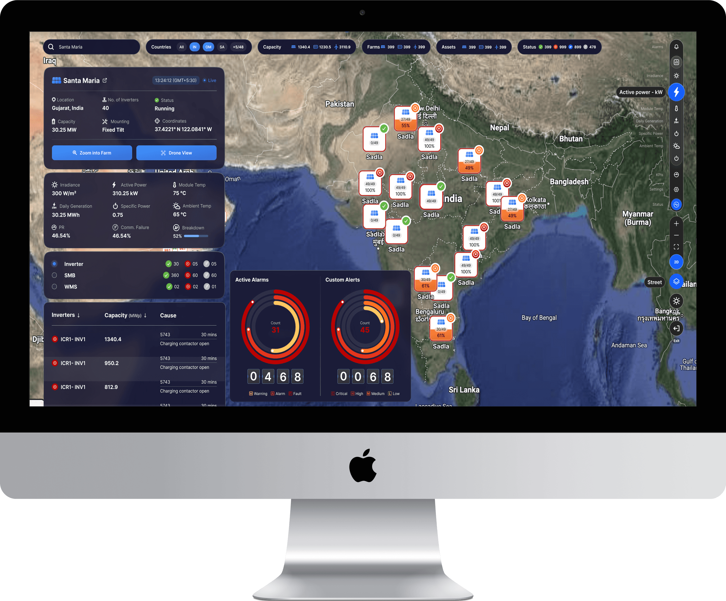
B. Site Operational View (Tactical)
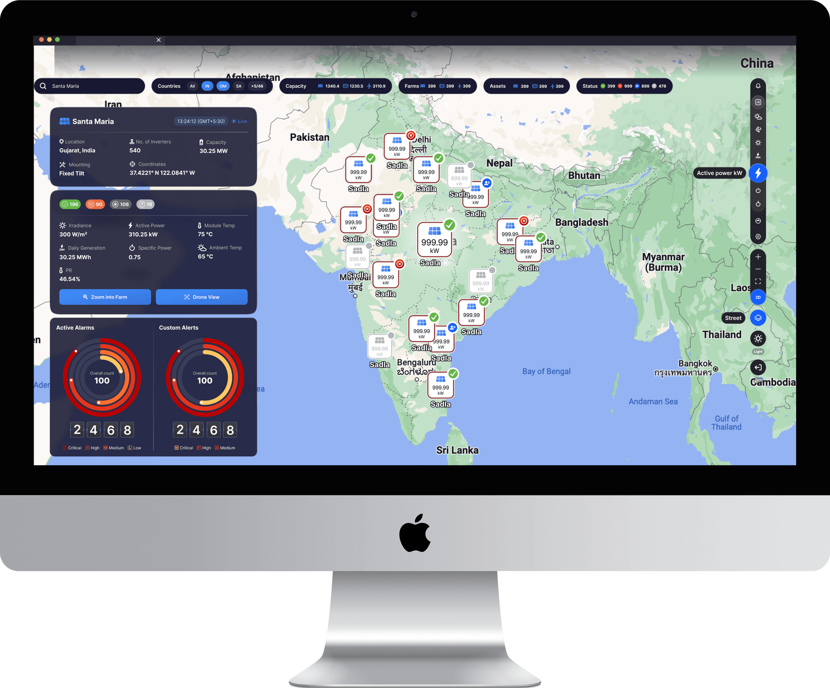
Upon clicking a region, the user zooms to a detailed map. This view provides real-time operational context for a specific site (e.g., Santa Maria).
Context Cards: The left panel provides all crucial site metadata (Location, Capacity, Coordinates) and real-time generation metrics (Irradiance, PR, Active Power).
Alarm Status: The bottom left features Active Alarms and Custom Alerts with a clear color-coded breakdown (Critical, High, Medium, Low), giving the user an immediate severity assessment.
Geospatial Interaction: The map itself shows individual asset performance overlays (e.g., kW readings over solar farms), allowing users to see the health of specific components within the larger site.


Impact and Innovation
Improved Portfolio Triage: The design allows managers to transition from a global view to a site-specific alarm summary in minimal clicks, significantly reducing the time required to prioritize and address critical operational issues.
Enhanced Data Synthesis: The dashboard successfully synthesized three disparate data streams (Solar, Wind, Storage) into a unified visual language (colors, icons, and filters), drastically simplifying cross-asset performance analysis.
Visual Engagement: The use of high-fidelity geospatial rendering elevates the user experience, transforming a functional dashboard into a highly engaging and professional enterprise tool.

More Projects


Product Design
Global Renewable Asset Monitoring
Designed a Geospatial Asset Management Dashboard for an enterprise client, focused on providing real-time portfolio oversight for Solar, Wind, and Storage assets.
Year :
2024
Industry :
Renewable Energy, Data Visualization, Geospatial Systems, Asset Management
Client :
Internal Product Design
Project Duration :
8 weeks
Problem : The Need for Global Strategic Oversight
The primary challenge was designing a single application view that could manage and visualize the status of a global, diverse portfolio of energy assets (solar farms, wind turbines, and storage facilities). Users (Executive Managers, Portfolio Analysts) needed to quickly answer: “Where are my assets, how are they performing, and which ones need immediate attention?” This required balancing a stunning geospatial visualization with functional, filterable, and real-time data overlays.
Solution : Layered and Contextual Visualization
We structured the solution with two primary, highly interactive visualization layers:
A. Global Portfolio View (Strategic)
The initial view uses a 3D Earth projection to map all assets globally. Crucially, the top bar acts as a primary filter, allowing users to segment the portfolio instantly by Capacity, Asset Type (Solar, Wind, Storage), and Status (Green, Yellow, Red). The use of distinct icons (squares, circles, triangles) ensures clarity across asset types. This view is designed for quick strategic decision-making and prioritization across countries and regions.
B. Site Operational View (Tactical)
Upon clicking a region, the user zooms to a detailed map. This view provides real-time operational context for a specific site (e.g., Santa Maria).
Context Cards: The left panel provides all crucial site metadata (Location, Capacity, Coordinates) and real-time generation metrics (Irradiance, PR, Active Power).
Alarm Status: The bottom left features Active Alarms and Custom Alerts with a clear color-coded breakdown (Critical, High, Medium, Low), giving the user an immediate severity assessment.
Geospatial Interaction: The map itself shows individual asset performance overlays (e.g., kW readings over solar farms), allowing users to see the health of specific components within the larger site.
Impact and Innovation
Improved Portfolio Triage: The design allows managers to transition from a global view to a site-specific alarm summary in minimal clicks, significantly reducing the time required to prioritize and address critical operational issues.
Enhanced Data Synthesis: The dashboard successfully synthesized three disparate data streams (Solar, Wind, Storage) into a unified visual language (colors, icons, and filters), drastically simplifying cross-asset performance analysis.
Visual Engagement: The use of high-fidelity geospatial rendering elevates the user experience, transforming a functional dashboard into a highly engaging and professional enterprise tool.
More Projects
Product Design
Global Renewable Asset Monitoring
Designed a Geospatial Asset Management Dashboard for an enterprise client, focused on providing real-time portfolio oversight for Solar, Wind, and Storage assets.
Year :
2024
Industry :
Renewable Energy, Data Visualization, Geospatial Systems, Asset Management
Client :
Internal Product Design
Project Duration :
8 weeks
Problem : The Need for Global Strategic Oversight
The primary challenge was designing a single application view that could manage and visualize the status of a global, diverse portfolio of energy assets (solar farms, wind turbines, and storage facilities). Users (Executive Managers, Portfolio Analysts) needed to quickly answer: “Where are my assets, how are they performing, and which ones need immediate attention?” This required balancing a stunning geospatial visualization with functional, filterable, and real-time data overlays.
Solution : Layered and Contextual Visualization
We structured the solution with two primary, highly interactive visualization layers:
A. Global Portfolio View (Strategic)
The initial view uses a 3D Earth projection to map all assets globally. Crucially, the top bar acts as a primary filter, allowing users to segment the portfolio instantly by Capacity, Asset Type (Solar, Wind, Storage), and Status (Green, Yellow, Red). The use of distinct icons (squares, circles, triangles) ensures clarity across asset types. This view is designed for quick strategic decision-making and prioritization across countries and regions.
B. Site Operational View (Tactical)
Upon clicking a region, the user zooms to a detailed map. This view provides real-time operational context for a specific site (e.g., Santa Maria).
Context Cards: The left panel provides all crucial site metadata (Location, Capacity, Coordinates) and real-time generation metrics (Irradiance, PR, Active Power).
Alarm Status: The bottom left features Active Alarms and Custom Alerts with a clear color-coded breakdown (Critical, High, Medium, Low), giving the user an immediate severity assessment.
Geospatial Interaction: The map itself shows individual asset performance overlays (e.g., kW readings over solar farms), allowing users to see the health of specific components within the larger site.
Impact and Innovation
Improved Portfolio Triage: The design allows managers to transition from a global view to a site-specific alarm summary in minimal clicks, significantly reducing the time required to prioritize and address critical operational issues.
Enhanced Data Synthesis: The dashboard successfully synthesized three disparate data streams (Solar, Wind, Storage) into a unified visual language (colors, icons, and filters), drastically simplifying cross-asset performance analysis.
Visual Engagement: The use of high-fidelity geospatial rendering elevates the user experience, transforming a functional dashboard into a highly engaging and professional enterprise tool.